

.PNG)
TLDR
- The best hospital website designs in 2026 prioritize patient-first UX, strong visual identity, accessible doctor search, and clear pathways to portals and appointments.
- Editorial design, human photography, and restrained color systems are replacing the traditional blue-and-white institutional look across leading health systems.
- Hospitals serving multiple audiences (patients, caregivers, referring physicians, visitors) need navigation and search that work for each group without adding complexity for the others.
- This list includes UCSF Health, Cedars-Sinai, Hospital for Special Surgery, Northwestern Medicine, Stanford Health Care, Children's Hospital Colorado, Children's Hospital Los Angeles, Ochsner Health, Houston Methodist, and Memorial Sloan Kettering Cancer Center.
- Each hospital's design is evaluated on visual identity, art direction, doctor search, patient portal accessibility, responsive design, and overall UX.
The best hospital website designs in 2026 combine strong visual identity, patient-centered UX, and practical functionality to make complex healthcare systems easier to navigate for patients, caregivers, and referring providers. The days of cluttered navigation menus, stock medical imagery, and generic blue-and-white layouts are fading. Leading hospitals and health systems have rebuilt their websites into experiences that feel closer to premium consumer brands than institutional portals.
Most large hospital websites run on enterprise CMS platforms like Drupal, Sitecore, or Adobe Experience Manager. The design principles in this guide apply regardless of the underlying technology. The focus is on visual design, UX, and patient experience rather than platform-specific implementation.
For this list, we evaluated each hospital's website on visual identity, art direction, doctor search, patient portal accessibility, navigation, and responsive design. We also looked at how each site's design system supports crucial functionality: provider directories, appointment scheduling, location finders, and healthcare content. These are the 10 hospital websites that stand out in 2026.
What Makes Great Hospital Website Design in 2026?
A great hospital website needs to do more than look professional. It needs to make a potentially stressful process feel clear and reassuring.
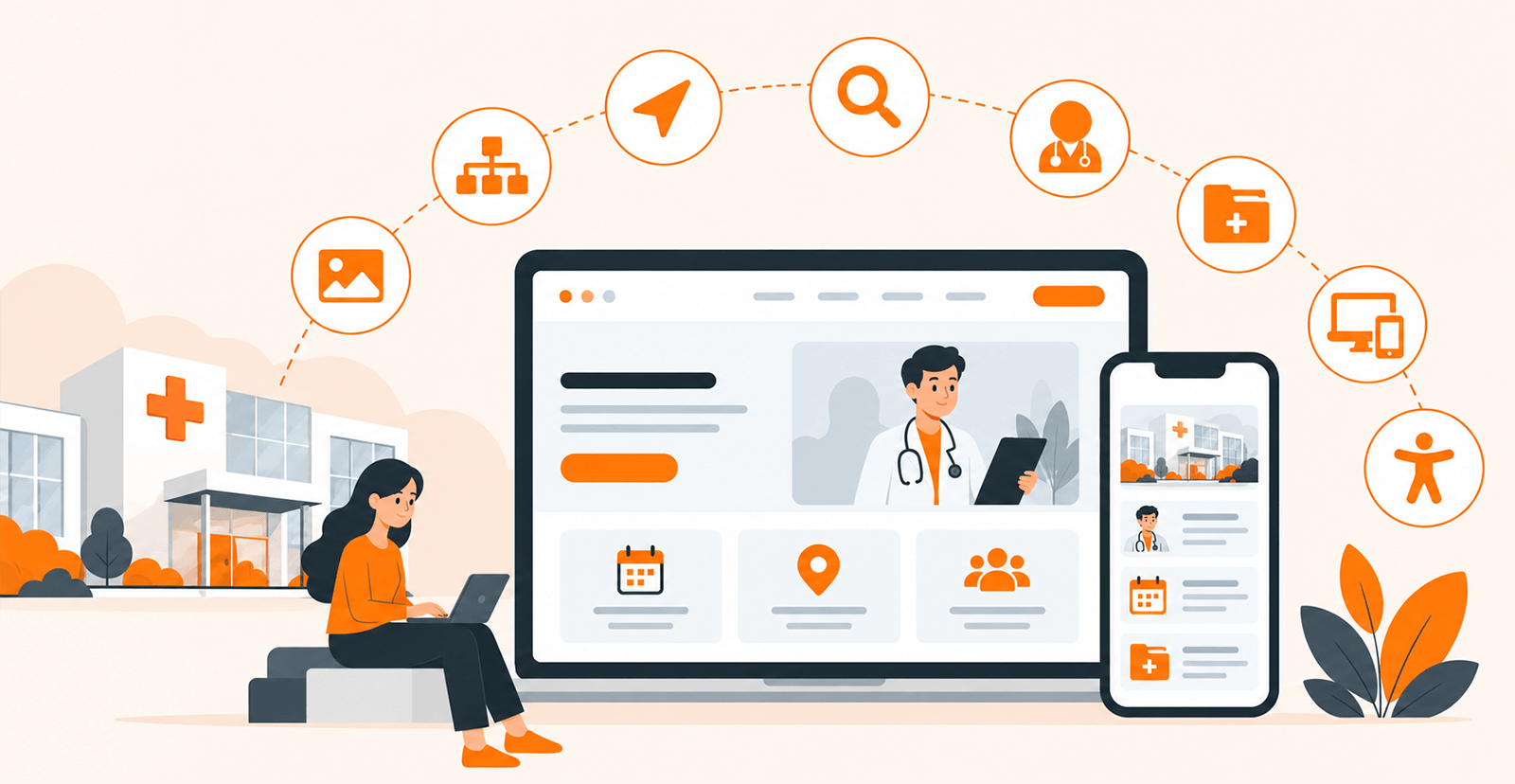
The strongest designs typically combine:
- Distinctive visual identity: Moving beyond generic medical imagery and predictable blue palettes.
- Strong art direction: High-quality photography, thoughtful cropping, editorial layouts, and human-centered imagery.
- Clear visual hierarchy: Users should immediately understand what the page is about and where they can go next.
- Smart navigation: Doctor search, appointments, locations, specialties, and patient resources should be easy to discover.
- Effective search: Search should accommodate conditions, symptoms, doctors, procedures, and services.
- Well-designed doctor directories: Provider profiles should make important information easy to scan.
- Accessible patient portals: Existing patients should be able to quickly reach their digital health records and care-management tools.
- Responsive design: The visual experience should work effectively across smaller screens.
- Accessible interfaces: Typography, contrast, labels, navigation, and interaction patterns should work for a broad range of users.
Hospital websites face a unique challenge that smaller healthcare organizations don’t: they serve multiple audiences simultaneously. A new patient researching a condition, a referring physician looking for a specialist, a caregiver managing a family member’s care, an existing patient accessing records, and a visitor looking for parking directions may all land on the same website. The best hospital designs acknowledge this complexity without making any single audience’s experience harder.
10 Best Hospital Website Designs of 2026
1. UCSF Health
UCSF Health uses a refined visual system that sets it apart from many traditional academic health system websites. Its current homepage uses a restrained palette, large photography, generous whitespace, and oversized typography to create a premium editorial feel. The homepage opens with a patient-focused headline and a prominent search field, immediately establishing a patient-first hierarchy.
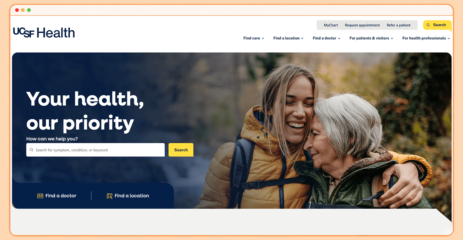
- Patient portal accessibility: MyChart is incorporated into the site's patient-services journey rather than dominating the visual experience.
- Doctor search: Patients can move directly from the homepage into doctor, location, specialty, or care searches.
- Key UX takeaway: Editorial design can work effectively for healthcare. Strong typography and imagery can make a complex medical website feel more like a premium digital publication than an institutional portal.
2. Cedars-Sinai
Cedars-Sinai is one of the strongest examples of a hospital website using human photography as a core design element rather than decoration. Its redesigned visual direction uses large portraits of physicians, spacious layouts, rounded containers, strong typography, and a restrained color system. The result resembles a premium consumer brand more than a conventional hospital website.
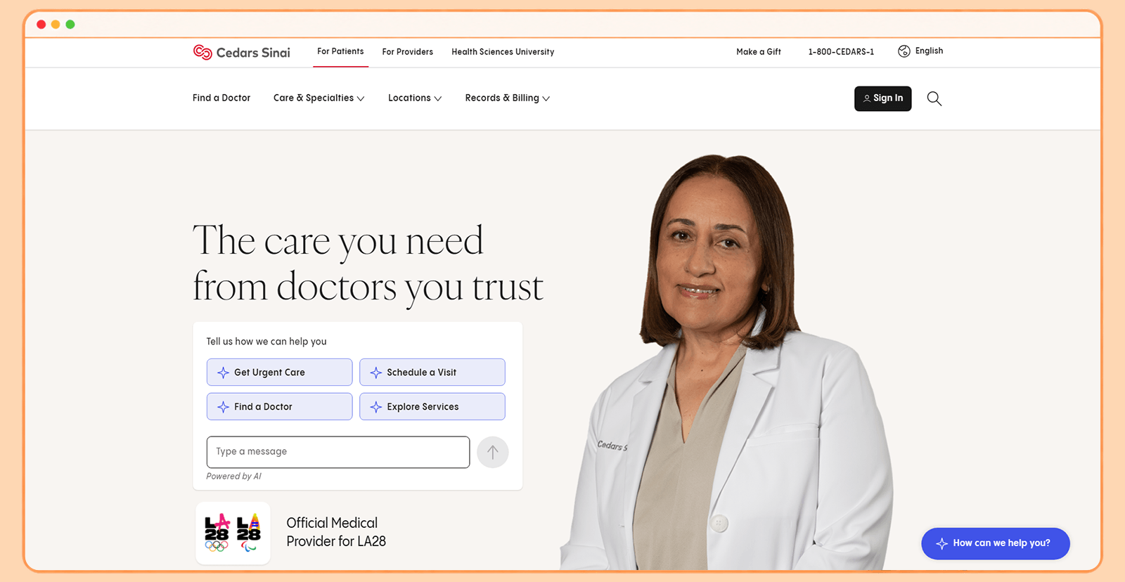
- Patient portal accessibility: My CS-Link sits within the patient tools ecosystem and provides access to care-management services.
- Doctor search: The Find a Doctor experience supports searches by condition, procedure, or name and provides physician information such as experience and training.
- Key UX takeaway: Humanize the institution. Using authentic images of clinicians and people can make a large healthcare organization feel more personal.
3. Hospital for Special Surgery (HSS)
Hospital for Special Surgery takes a more editorial and lifestyle-oriented approach to hospital web design. Because it focuses on orthopedics and musculoskeletal care, the site uses movement, athletic imagery, patient stories, and strong photography to communicate its brand. Its homepage moves beyond the conventional hospital-directory format. Instead, large patient stories and movement-focused imagery reinforce its central promise: helping people return to the activities they enjoy.
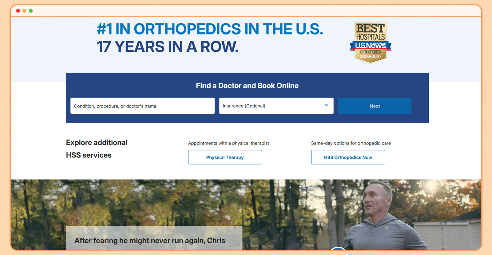
- Patient portal accessibility: MyHSS is clearly surfaced for existing patients, allowing them to manage care, message doctors, and access health information.
- Doctor search: The homepage places Find a Doctor and Book Online directly into the primary patient journey.
- Key UX takeaway: Specialization should influence the visual language. HSS doesn't just say it treats movement-related conditions; its imagery and storytelling communicate movement visually.
4. Northwestern Medicine
Northwestern Medicine uses a polished, contemporary design that combines large photography, strong typography, dark sections, clean cards, and generous spacing. Its visual language feels modern without becoming overly experimental. One notable feature is the way content is organized around what patients actually want to know. Instead of forcing visitors to navigate an organizational chart, the website connects conditions, services, physicians, locations, and appointments.
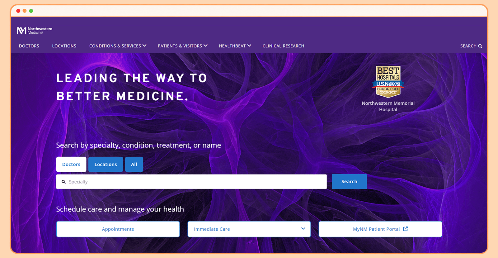
- Patient portal accessibility: MyNM is positioned alongside appointment scheduling and immediate-care options in the homepage’s primary action area, so returning patients reach their portal without scrolling past marketing content.
- Doctor search: The website provides dedicated pathways to finding physicians and their contact information.
- Key UX takeaway: Visual simplicity becomes more valuable as the amount of content increases.
5. Stanford Health Care
Stanford Health Care takes a clean, technology-forward approach that suits its Silicon Valley identity. The design emphasizes structured layouts, contemporary photography, strong search functionality, and clear pathways into care. The website avoids excessive visual effects. Instead, it uses whitespace, typography, content modules, and carefully positioned calls to action to maintain a clean and structured experience.
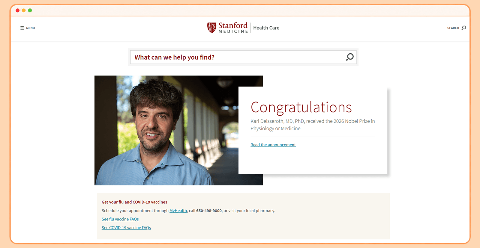
- Patient portal accessibility: MyHealth is deeply integrated into the patient journey, allowing users to schedule appointments, view records, message care teams, manage prescriptions, and pay bills.
- Doctor search: Dedicated pathways make finding doctors and providers straightforward.
- Key UX takeaway: Modern healthcare design doesn't need to be flashy. A strong grid, typography system, photography, and clear interaction patterns can create a highly sophisticated result.
6. Children's Hospital Colorado
Children's Hospital Colorado demonstrates how a hospital can move away from the sterile visual conventions of adult healthcare. Its website uses bright imagery, friendly illustrations/icons, expressive photography, and warmer messaging to create an experience designed around children and their families. The homepage balances urgent actions such as emergency care and finding a doctor with more emotional content about children, families, research, and recovery.
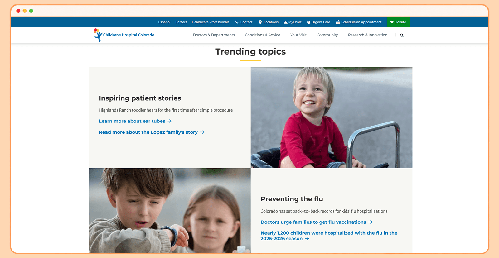
- Patient portal accessibility: Parent and patient resources are incorporated into the broader care experience.
- Doctor search: Find a Doctor is presented as a prominent primary action rather than a buried navigation item
- Key UX takeaway: Know your audience. A children's hospital shouldn't necessarily look like an adult hospital with cartoon graphics added afterward.
7. Children's Hospital Los Angeles
Children's Hospital Los Angeles takes a similarly human-centered approach but with a strong emphasis on large photography and family-focused storytelling. The visual design gives children and caregivers a central role, rather than relying entirely on doctors, buildings, or medical equipment. The homepage combines an emotional hero image with a straightforward Find a Doctor search, creating a useful balance between storytelling and functionality.
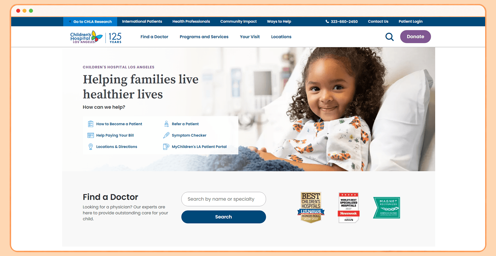
- Patient portal accessibility: Patient and family resources are incorporated into the site's care pathways.
- Doctor search: The homepage allows users to search by physician name or specialty.
- Key UX takeaway: Emotion can be a functional design tool. For families dealing with pediatric illness, warmth and reassurance are part of the user experience.
8. Ochsner Health
Ochsner Health uses a bold, contemporary healthcare aesthetic with large imagery, clear search experiences, and strong calls to action. The design doesn't attempt to hide the scale of the organization; instead, it uses visual hierarchy to make the large amount of information manageable. The homepage gives prominent placement to finding doctors, locations, health resources, and patient access.
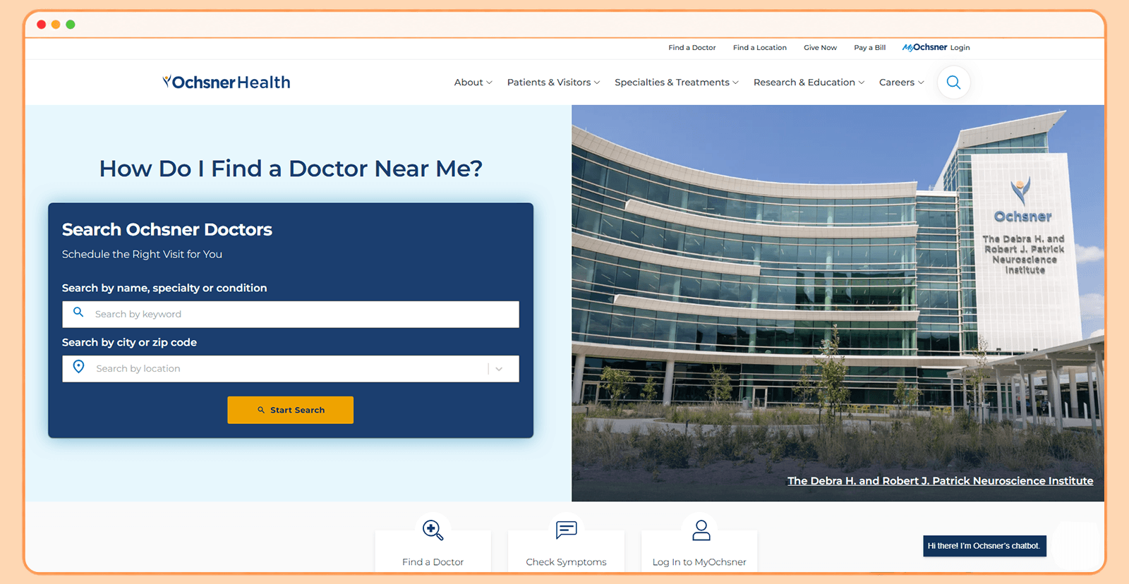
- Patient portal accessibility: MyOchsner is prominently surfaced for appointments, test results, prescriptions, and other patient functions.
- Doctor search: Find a Doctor is one of the primary actions on the site.
- Key UX takeaway: Search can be part of the visual identity. Instead of forcing users through layers of navigation, Ochsner searches are a central component of the experience.
9. Houston Methodist
Houston Methodist uses a clean, structured visual system with strong photography, a restrained color palette, bold headings, and highly visible search components. The homepage is particularly effective at turning a huge healthcare network into a set of simple actions. Visitors can search for doctors, locations, specialties, and care options without first needing to understand the organization.
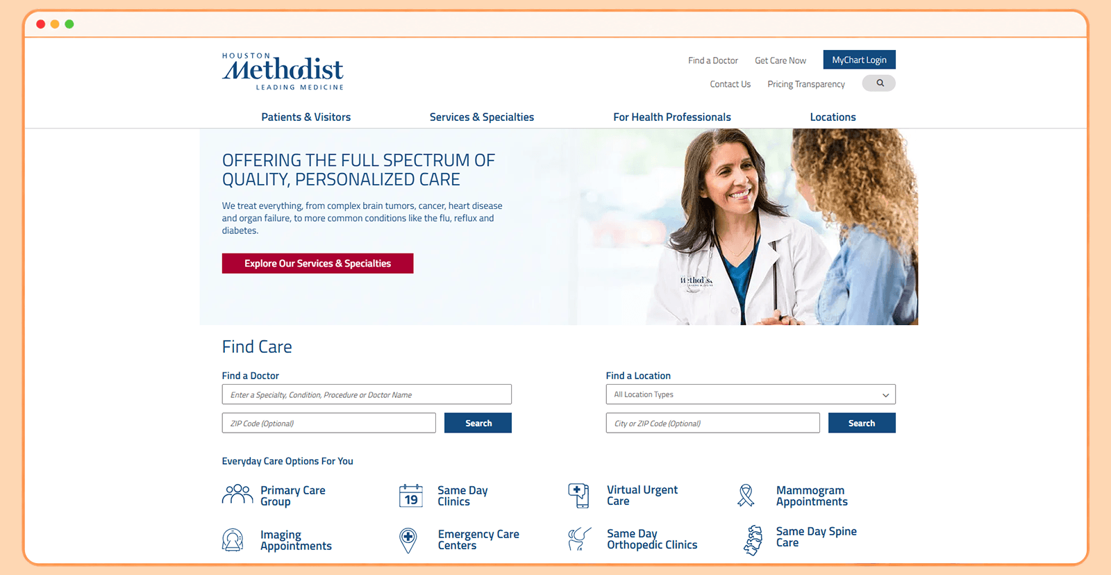
- Patient portal accessibility: Patient tools are integrated into the site's broader navigation and care journeys.
- Doctor search: Doctor search is one of the site's prominent functional pathways.
- Key UX takeaway: A strong search interface can be a design feature, not merely a utility.
10. Memorial Sloan Kettering Cancer Center
Memorial Sloan Kettering Cancer Center takes a more editorial, content-led approach. Cancer care is an emotionally difficult subject, and the website uses photography, patient stories, research content, and reassuring messaging to make the experience feel more human. The design gives content considerable visual space rather than treating every page as a functional directory. This creates an experience that resembles a trusted health publication while maintaining clear pathways toward care.
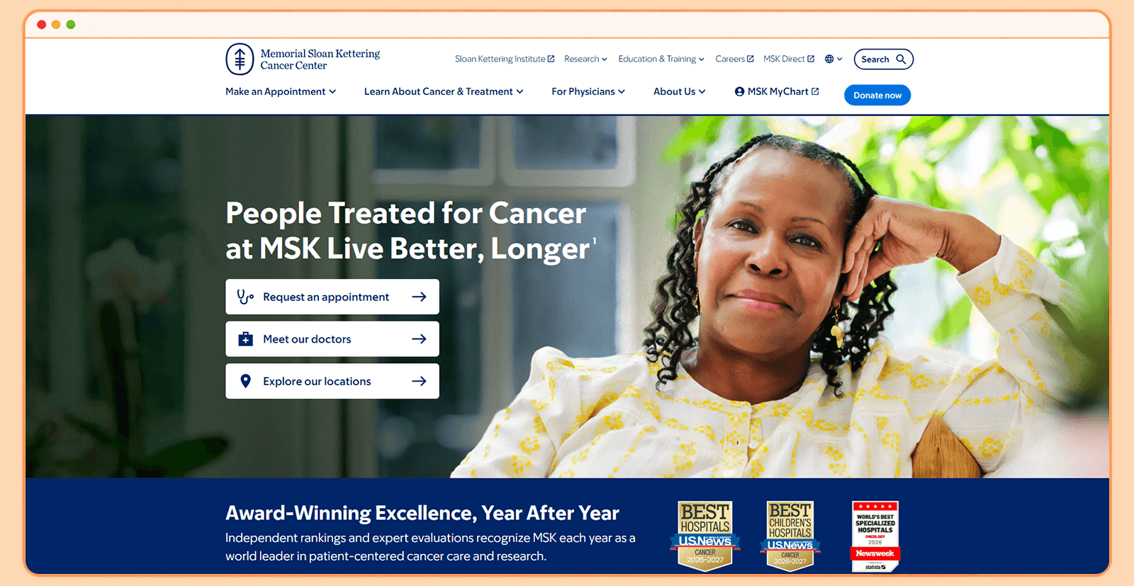
- Patient portal accessibility: Patient support and portal access are incorporated into the site's patient-care ecosystem.
- Doctor search: Provider discovery is integrated into the broader care journey.
- Key UX takeaway: Healthcare websites need emotional intelligence. Typography, imagery, language, and storytelling can influence how supported a visitor feels before they ever interact with a healthcare professional.
How Quixta Can Help Build a Modern Hospital Website
The hospital websites featured above demonstrate that healthcare organizations don't have to choose between engaging design and practical functionality. A successful website needs both. Quixta can help hospitals and healthcare organizations create custom digital experiences built around their brand, patients, and business objectives. Its approach can include:
- UX research and information architecture to create intuitive patient journeys and simplify complex healthcare information.
- Custom UI/UX design with distinctive visual systems, typography, photography, layouts, and interactions that reflect the hospital's brand.
- Responsive website development to ensure a consistent experience across desktops, tablets, and mobile devices.
- Doctor directories and provider search that help patients find the right physician by specialty, location, condition, or other relevant criteria.
- Appointment-booking journeys that reduce friction between finding a doctor and scheduling care.
- Patient portal integrations that provide convenient access to existing digital healthcare services.
- Location and facility finders that make it easier for patients to locate hospitals, clinics, departments, and urgent-care facilities.
Conclusion
The hospital websites on this list share a common principle: design decisions should be shaped by patient experience, not by convention. UCSF Health uses editorial layouts and restrained typography to make a complex academic system feel approachable. Cedars-Sinai puts human photography at the center of its visual identity. HSS builds its entire design language around movement and recovery. Children's Hospital Colorado and Children's Hospital Los Angeles show that pediatric hospitals need their own visual vocabulary, not a reskinned version of an adult hospital site.
What separates these hospitals from the average healthcare website is not one specific color palette, layout, or CMS platform. It is the deliberate connection between design choices and the experience those choices create for patients, caregivers, and providers. A strong doctor search, a well-positioned patient portal, clear visual hierarchy, and photography that reflects real people are not decorative choices. They are functional ones that influence how supported a visitor feels before they ever speak to a healthcare professional.
Ready to Build a Hospital Website That Puts Patients First?
Quixta designs and builds custom hospital websites with patient-centered UX, provider directories, appointment-booking journeys, portal integrations, and responsive development. If your hospital or health system is planning a redesign or a new build, talk to Quixta about your project.
FAQs
A standout hospital website combines visual appeal with an intuitive and patient-focused user experience. Strong typography, high-quality photography, thoughtful layouts, whitespace, and a distinctive color palette can help a hospital establish a recognizable digital identity. The design should also make important actions such as finding a doctor, booking an appointment, and locating a facility easy to discover. The best hospital website designs balance professionalism, warmth, functionality, and brand personality. Ultimately, the website should feel modern while making healthcare information easier to understand.
Visual design plays an important role in shaping how patients perceive a healthcare organization. A well-designed website can communicate professionalism, credibility, compassion, and expertise before a patient ever interacts with the hospital. Human-centered imagery can make a large medical institution feel more approachable and less intimidating. However, aesthetics should always support usability rather than distract from it. The strongest hospital websites use visual design to make important information and actions easier to find.
A modern hospital website should provide easy access to essential patient services and information. These commonly include doctor directories, appointment booking, hospital and location finders, specialty pages, contact information, and patient portals. A powerful search function can also help visitors quickly find doctors, conditions, treatments, services, and other healthcare information. Websites should be responsive so that these features work effectively on smartphones, tablets, and desktops.
A hospital doctor directory should make it easy for patients to find the right healthcare professional in a few steps. Search functionality should let users find providers by name, specialty, condition, location, or other relevant criteria. Filters should be clearly presented and easy to reset when patients want to modify their search. Calls to action such as "Book an Appointment" should be easy to identify without overwhelming the page. A well-designed directory turns a complicated database into a straightforward patient decision-making tool.
A patient portal should be easy to locate without taking over the entire hospital website. A prominent but visually consistent login option can help existing patients access their accounts quickly. Depending on the healthcare system, the portal may provide access to appointments, medical records, test results, prescriptions, billing, and communication with care teams. The transition between the main website and the patient portal should feel clear so users understand when they are entering a separate secure environment. Portal-related calls to action should also be distinguishable from general website navigation.
Photography can significantly influence the personality and emotional tone of a hospital website. Instead of relying exclusively on generic images of doctors, equipment, and hospital buildings, modern websites often use authentic images of patients, physicians, families, and care environments. Photography style should align with the hospital's brand and the audience it serves. For example, a children's hospital may use more expressive, playful imagery, while a cancer center may use more editorial, emotionally sensitive photography.
Hospitals can improve navigation by organizing their websites around common patient goals rather than their internal organizational structure. Important destinations such as "Find a Doctor," "Book an Appointment," "Locations," "Services," and "Patient Portal" should be easy to identify. Large hospital websites can also use consistent page templates and design components to help visitors understand how different sections work. The goal is to help patients find the information or service they need without requiring them to understand how the hospital is organized.
Responsive design ensures that a hospital website remains usable across smartphones, tablets, laptops, and desktop computers. This is particularly important because patients may search for healthcare information while traveling, waiting for an appointment, or dealing with an urgent need. A responsive website can prevent users from having to zoom, scroll excessively, or switch devices to complete basic tasks. Mobile performance also contributes to the overall perception of the hospital's digital experience. A visually impressive desktop website is not enough if its mobile experience feels difficult or outdated.
Hospital websites can build trust by presenting information clearly, maintaining visual consistency, and communicating expertise without appearing intimidating. Professional photography, authentic patient stories, physician profiles, credentials, awards, and transparent information can all contribute to credibility. Accessibility and security are also important because patients need to feel confident using the website to access sensitive healthcare information. At the same time, overly corporate or sterile visuals can make a hospital feel distant. The strongest designs balance medical authority with warmth, clarity, and human-centered storytelling.
The cost of designing a hospital website varies significantly. A smaller hospital website may range from $50,000 to $100,000, while large health systems with hundreds of pages, multiple locations, provider directories, patient portals, and complex integrations can exceed $150,000. Features like appointment scheduling, EHR integration, multilingual content, and accessibility requirements affect the final cost. For a detailed breakdown, see our guide on healthcare website design cost in 2026.
