
TLDR
- The 10 dental websites featured include Smile and Company, Grand Street Dental, Digital Smile Academy, ArchPoint, Beverly Hills Dentistry, Bite Dental Studios, Grind Dentistry, Zen Dental Studio, Tusk Dental, and Sprout Dental.
- Effective dental website design goes beyond aesthetics. It reduces the distance between a visitor's first impression and their decision to book an appointment.
- The strongest dental websites share common principles: a strong first impression, visible booking CTAs, trust signals on every page, anxiety-reducing visuals, and content that answers patient questions upfront.
- Dental practices don't need to follow a clinical template. Successful designs range from luxury and minimalist to playful and child-friendly.
The best dental practice website designs in 2026 combine distinctive branding, patient-focused UX, trust-building content, and clear conversion paths that make appointment booking effortless. Before choosing a dentist, prospective patients evaluate the website to understand which treatments are available, whether they can trust the team, what the experience will be like, and how easily they can schedule an appointment. That makes website design a direct factor in turning visitors into patients.
Attractive visuals capture attention, but effective dental websites go further. They bring together clear calls to action, useful treatment information, professional imagery, patient testimonials, and a straightforward booking process.
This guide highlights 10 dental websites that stand out in 2026 for balancing visual design, usability, trust, and conversion. Each example is followed by what other practices can learn from their approach.
10 Dental Practice Website Designs That Make Booking Easier
1. Smile and Company
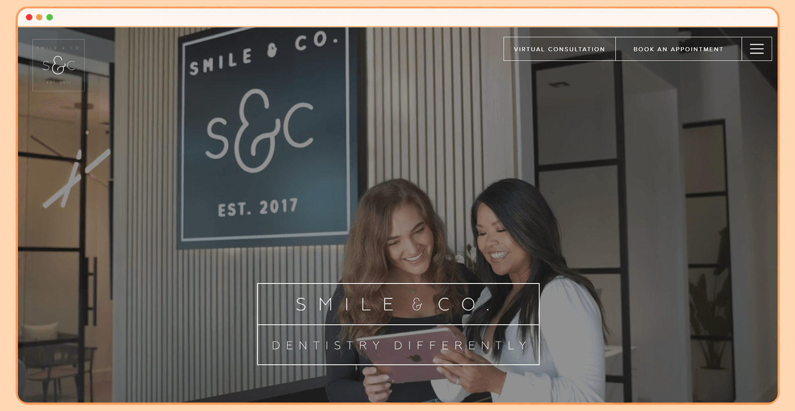
Smile and Company takes a sophisticated approach to dental website design. Its website immediately feels more like a premium lifestyle brand than a conventional healthcare website, helping the practice establish a distinctive identity from the first interaction.
What makes Smile and Company's website stand out?
The website uses a monochromatic visual direction, high-quality imagery, and generous whitespace to create a polished, contemporary aesthetic. The hero section makes a strong first impression without overwhelming people with information. The navigation prioritizes treatment categories over generic menu labels, letting prospective patients self-select into cosmetic, restorative, or general dentistry pathways without searching through a dropdown.
Why does this design appeal to patients?
The polished presentation can help prospective patients feel more confident in the practice. For people considering cosmetic or elective treatments, this perception matters. More importantly, clear appointment CTAs make it easy to move from exploring the website to scheduling a visit.
A closer look at their website:
2. Grand Street Dental
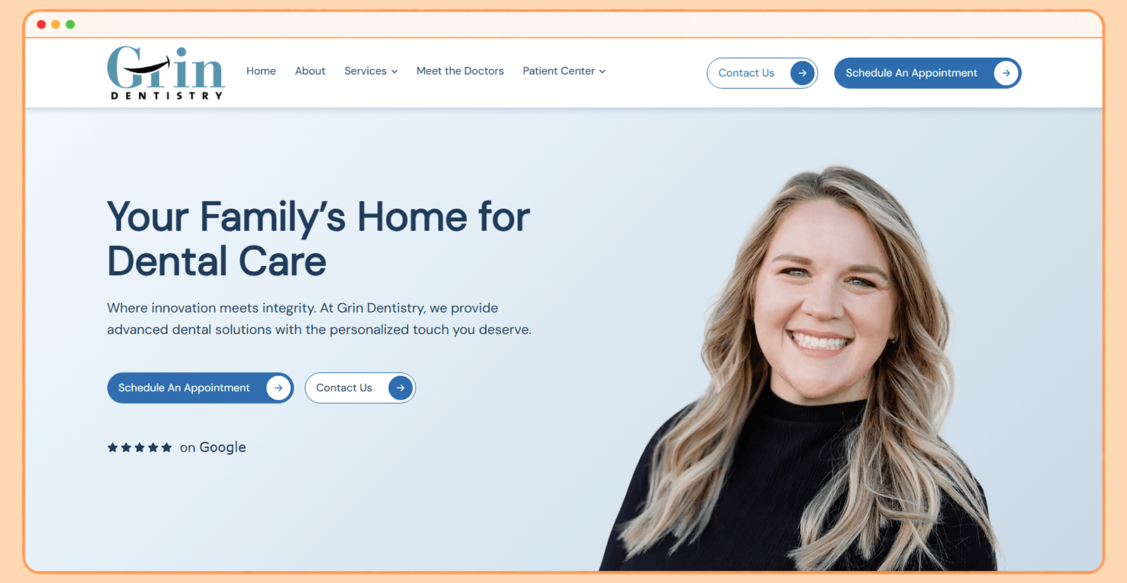
Grand Street Dental takes a more expressive approach to dental website design. Instead of relying on the familiar clinical blue-and-white palette, the website uses distinctive visual elements to create a memorable brand experience.
What makes Grand Street Dental's website stand out?
Its combination of geometric shapes, generous whitespace, and bold compositions gives the website a distinctive character. These elements add personality while maintaining a clean underlying structure. The structured content sections break treatment information into scannable blocks with clear headings, reducing the wall-of-text effect that many dental websites default to.
Why does this design appeal to patients?
A distinctive visual identity helps the practice stand out. The website balances personality with usability. Prospective patients can quickly find key information and pathways to book. This combination helps the practice feel approachable without sacrificing professionalism.
A closer look at their website:
3. Digital Smile Academy
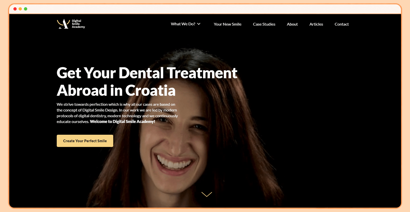
Digital Smile Academy uses a darker, more sophisticated visual style that immediately differentiates it from conventional dental websites.
What makes Digital Smile Academy's website stand out?
Full-width imagery and embedded video create an immersive first impression, while the grid-based layout keeps the content organized. The design also uses strong typography to establish hierarchy. Visitors can quickly distinguish headlines, supporting information, and calls to action.
Why may the website appeal to patients?
The website communicates expertise without making the experience feel intimidating. This is especially useful for practices offering advanced or cosmetic dental treatments, where patients may compare providers before deciding. Strong visuals help communicate the quality of the practice, while clear calls to action provide an obvious next step.
A closer look at their website:
4. ArchPoint
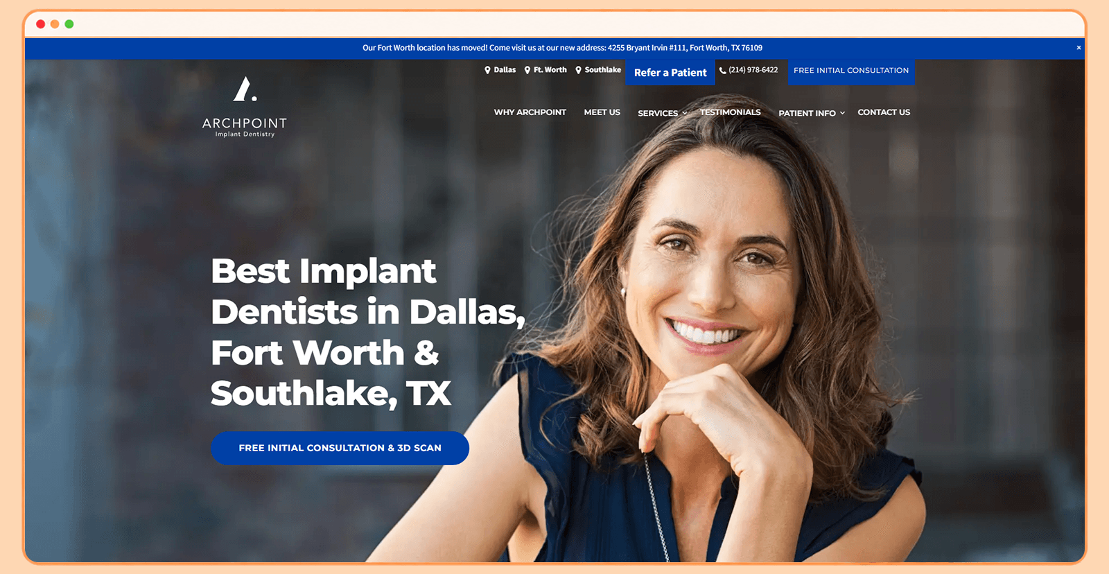
ArchPoint combines premium photography with a clean, contemporary interface to create a sophisticated online dental experience.
What makes ArchPoint's website stand out?
The website's hero section immediately establishes its visual identity. High-quality photography gives the practice a polished appearance, while a strong headline communicates its positioning. Sticky navigation keeps conversion actions within easy reach as visitors scroll, rather than forcing them back to the top of the page.
Why may the website appeal to patients?
The design creates a strong perception of quality while making the website easy to navigate. This combination is particularly valuable for patients who may be nervous about choosing a new dentist. The persistent navigation also reduces friction. Visitors don't need to scroll all the way back to the top to find important information or take action.
A closer look at their website:
5. Beverly Hills Dentistry
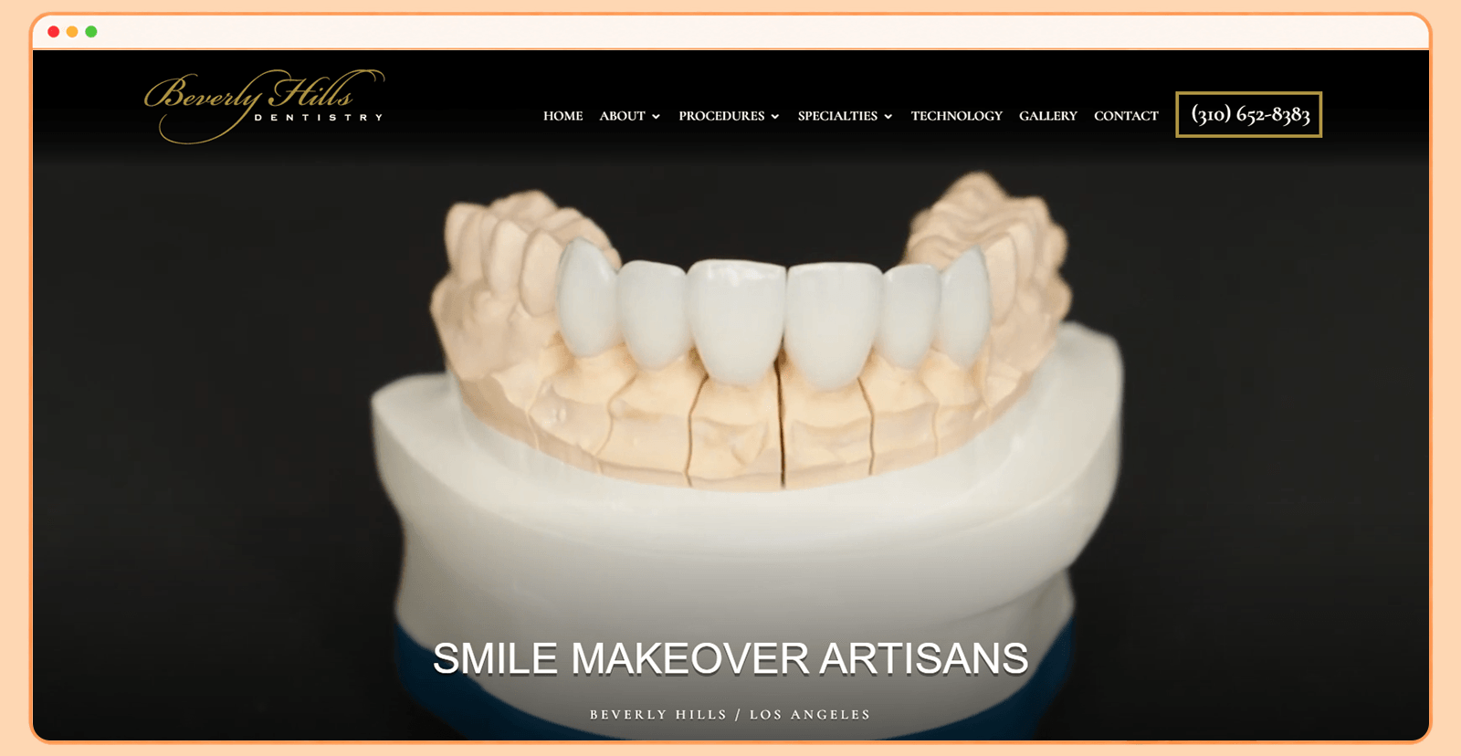
Beverly Hills Dentistry embraces the premium positioning associated with its location. Its website uses luxury-oriented visual elements to create a high-end experience.
What makes Beverly Hills Dentistry's website stand out?
The website uses cinematic photography, sophisticated typography, and restrained gold accents to communicate exclusivity. Instead of looking like a generic medical website, it feels intentionally designed around a premium dental brand. The website also creates a clear visual hierarchy, helping visitors move through the content without becoming overwhelmed.
Why may the website appeal to patients?
The website is designed around confidence and aspiration. Patients considering cosmetic dentistry often want to know not only what a treatment involves but also what results they can expect. The premium branding helps distinguish the practice from more conventional local competitors.
A closer look at their website:
6. Bite Dental Studios
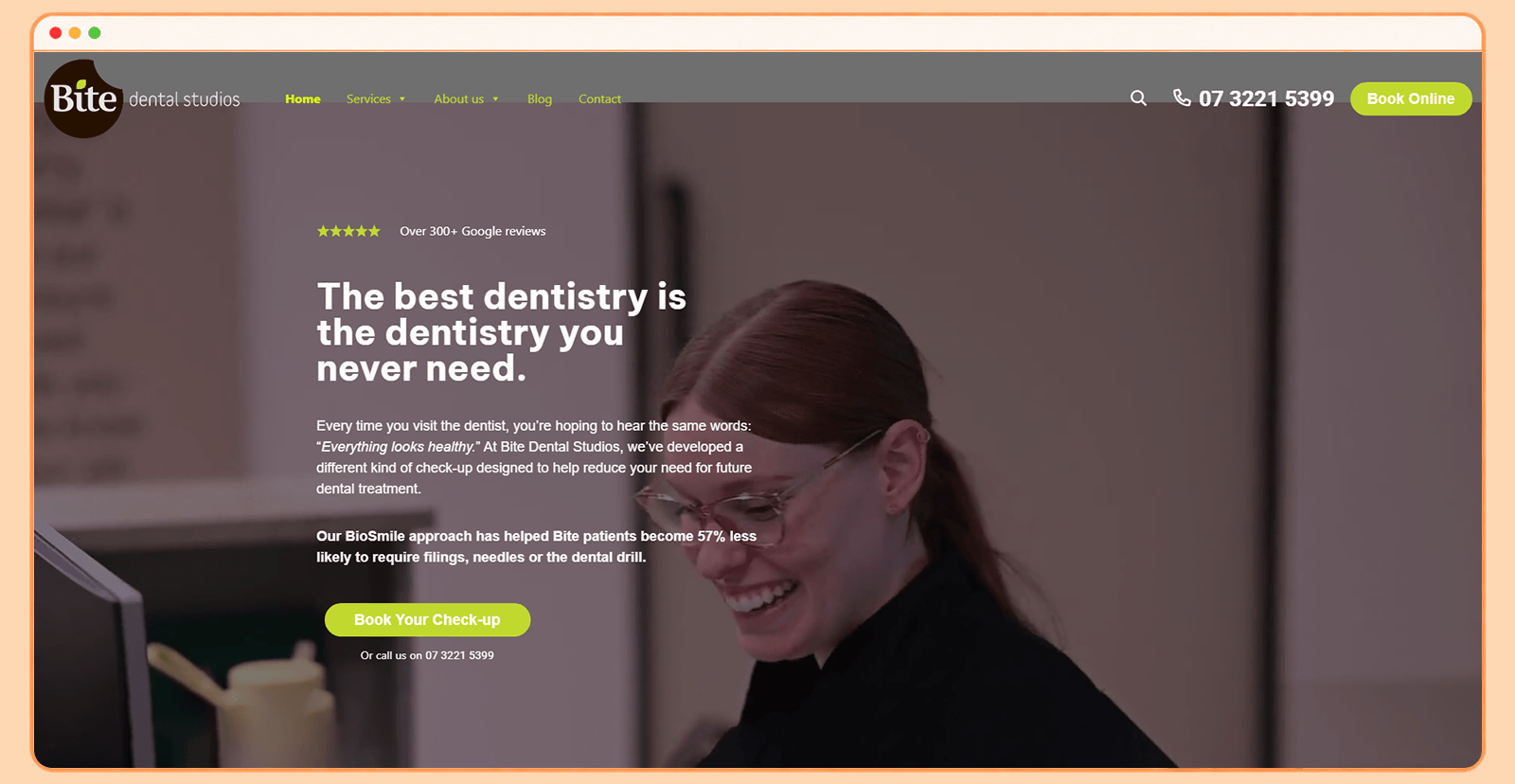
Bite Dental Studios takes a completely different direction with a bold and playful website.
What makes Bite Dental Studios' website stand out?
Bright colors, illustrations, unconventional layouts, and energetic visual elements make the website immediately distinctive. This works because most dental websites default to clinical blue-and-white aesthetics. The design has personality while still presenting the necessary practice information. Visual elements also make the experience feel less intimidating.
Why may the website appeal to patients?
The biggest conversion advantage is approachability. Dental anxiety can be a significant barrier for prospective patients, and a friendly website may ease some of that hesitation before a patient ever walks through the door. The playful branding makes the practice feel welcoming and accessible. Visitors can get a sense of the practice's personality before booking.
A closer look at their website:
7. Grind Dentistry
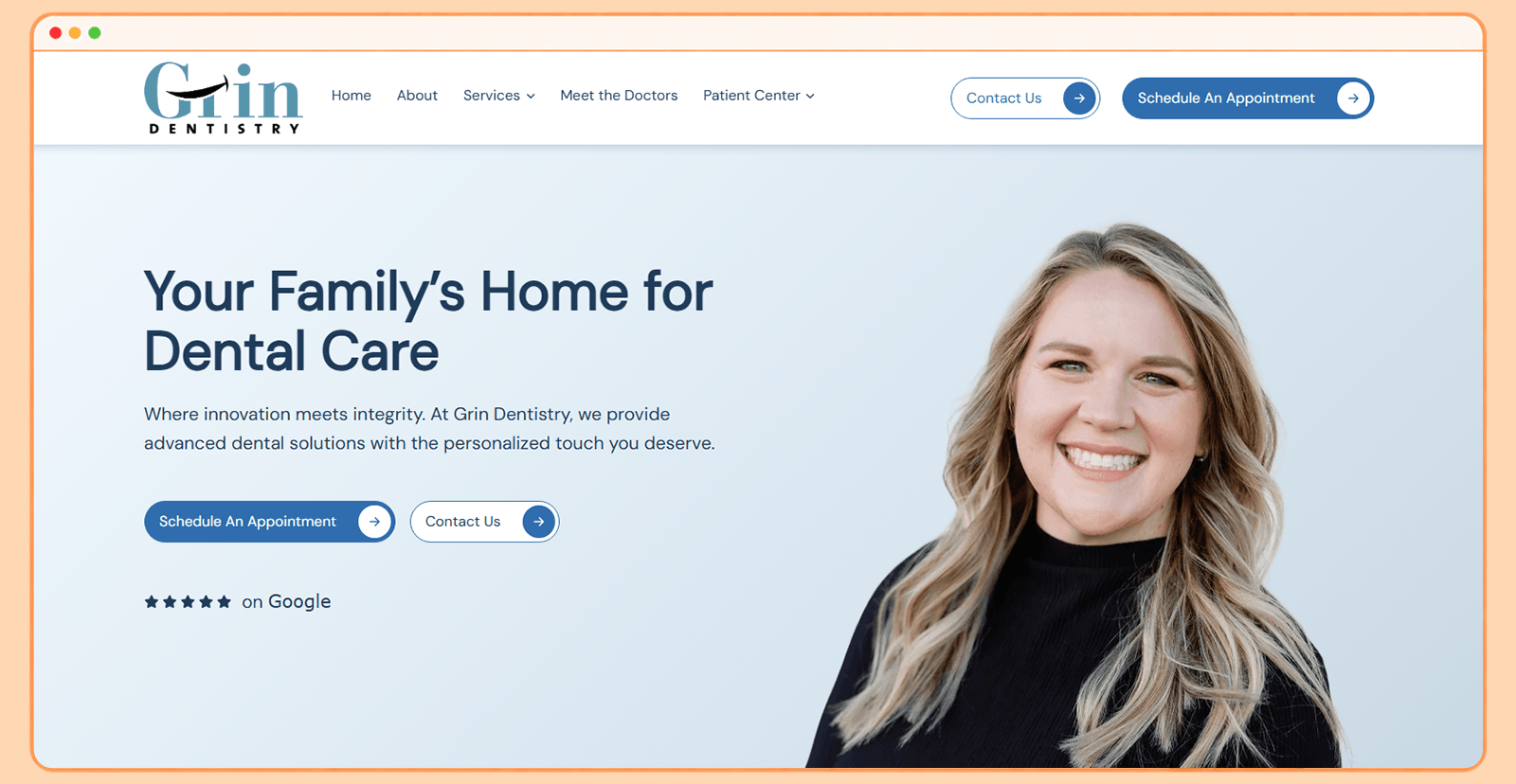
Grind Dentistry demonstrates how a minimalist approach can create a sophisticated dental website without relying on excessive visual effects.
What makes Grind Dentistry's website stand out?
The design uses clean layouts, strong typography, generous whitespace, and a restrained visual system. Rather than filling every section with information, the design prioritizes what visitors need to know and presents it in digestible blocks. The overall aesthetic also feels more like a contemporary brand than a traditional dental clinic.
Why may the website appeal to patients?
Simplicity reduces cognitive load. Visitors don't have to navigate through complicated interfaces or decipher dense blocks of content to understand what the practice offers. When visitors can quickly understand the practice, its services, and what to do next, the path to booking becomes shorter.
The minimalist approach also means that CTAs aren't competing with decorative elements for attention. When the page is clean, the 'Book Now' button stands out naturally without needing aggressive styling or animation.
A closer look at their website:
8. Zen Dental Studio
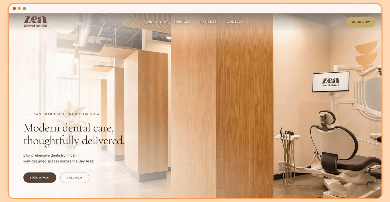
Zen Dental Studio uses its website to reinforce the calming experience its name suggests.
What makes Zen Dental Studio's website stand out?
The website uses a soft, refined visual language with warm photography, neutral tones, whitespace, and a spa-like aesthetic. The layout remains clean and intuitive, while warm photography and neutral tones maintain a consistent sense of calm.
Why may the website appeal to patients?
Instead of simply communicating treatments and qualifications, Zen Dental Studio's design suggests comfort, care, and relaxation. That emotional positioning can help reduce hesitation among visitors who are nervous about dental treatment.
For patients who have been avoiding the dentist due to anxiety, the calming visual language serves a direct conversion purpose. It reduces the emotional barrier that prevents them from clicking 'Book an Appointment.
A closer look at their website:
9. Tusk Dental
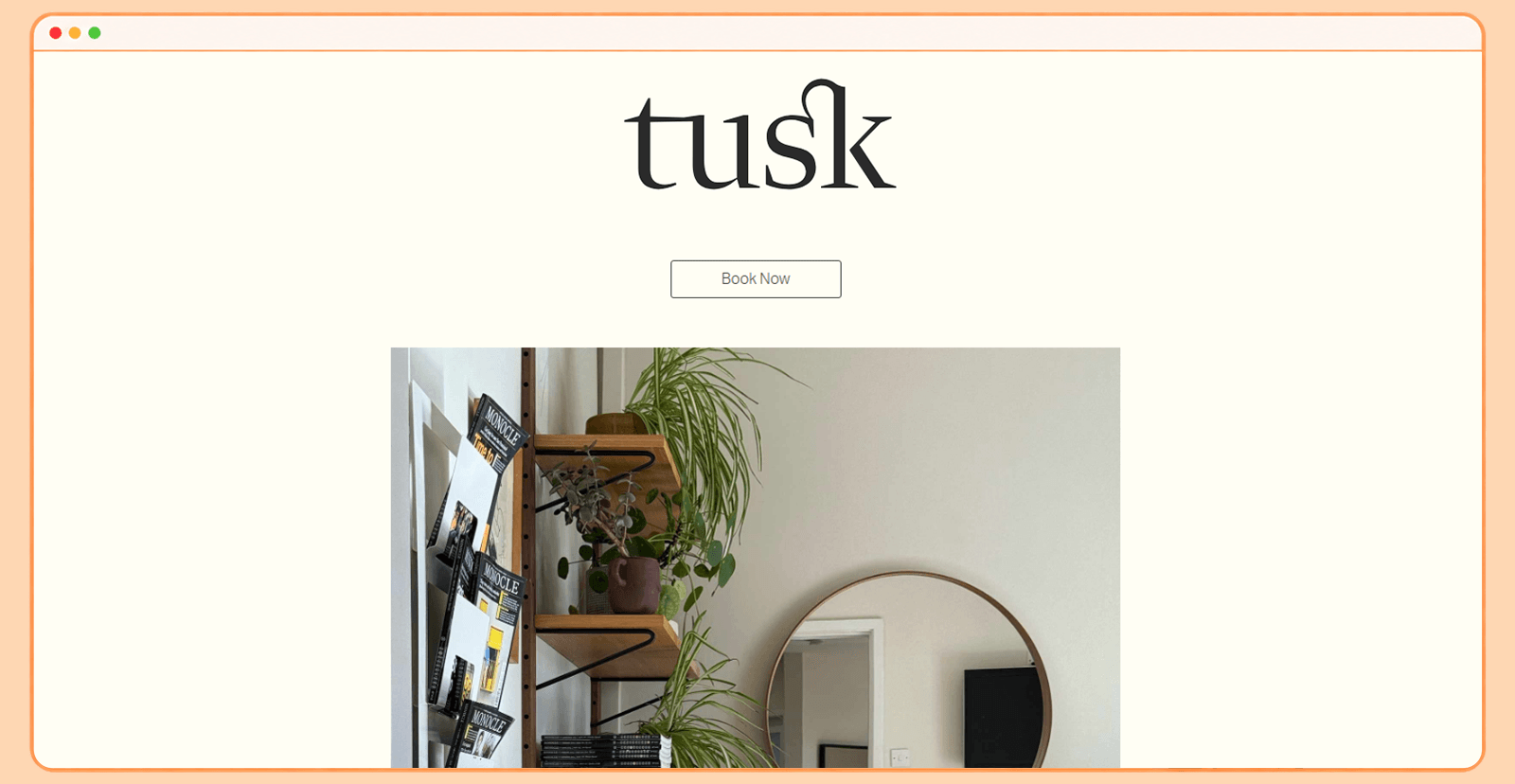
Tusk Dental uses contemporary branding and a clean interface to create a modern alternative to traditional dental websites.
What makes Tusk Dental's website stand out?
The website has a strong brand identity and avoids many of the visual conventions associated with conventional dental practices. A consistent visual system makes every page feel like part of the same brand experience.
Why may the website appeal to patients?
The website's modern positioning can appeal to patients who value convenience, contemporary experiences, and a more progressive approach to healthcare. The key takeaway is that a strong digital brand can differentiate a practice before a patient ever compares treatment options or pricing.
The consistent brand system also means that every page reinforces the same conversion path. Whether a visitor lands on a treatment page, an about page, or the homepage, the next step toward booking is always visible and consistent.
A closer look at their website:
10. Sprout Dental
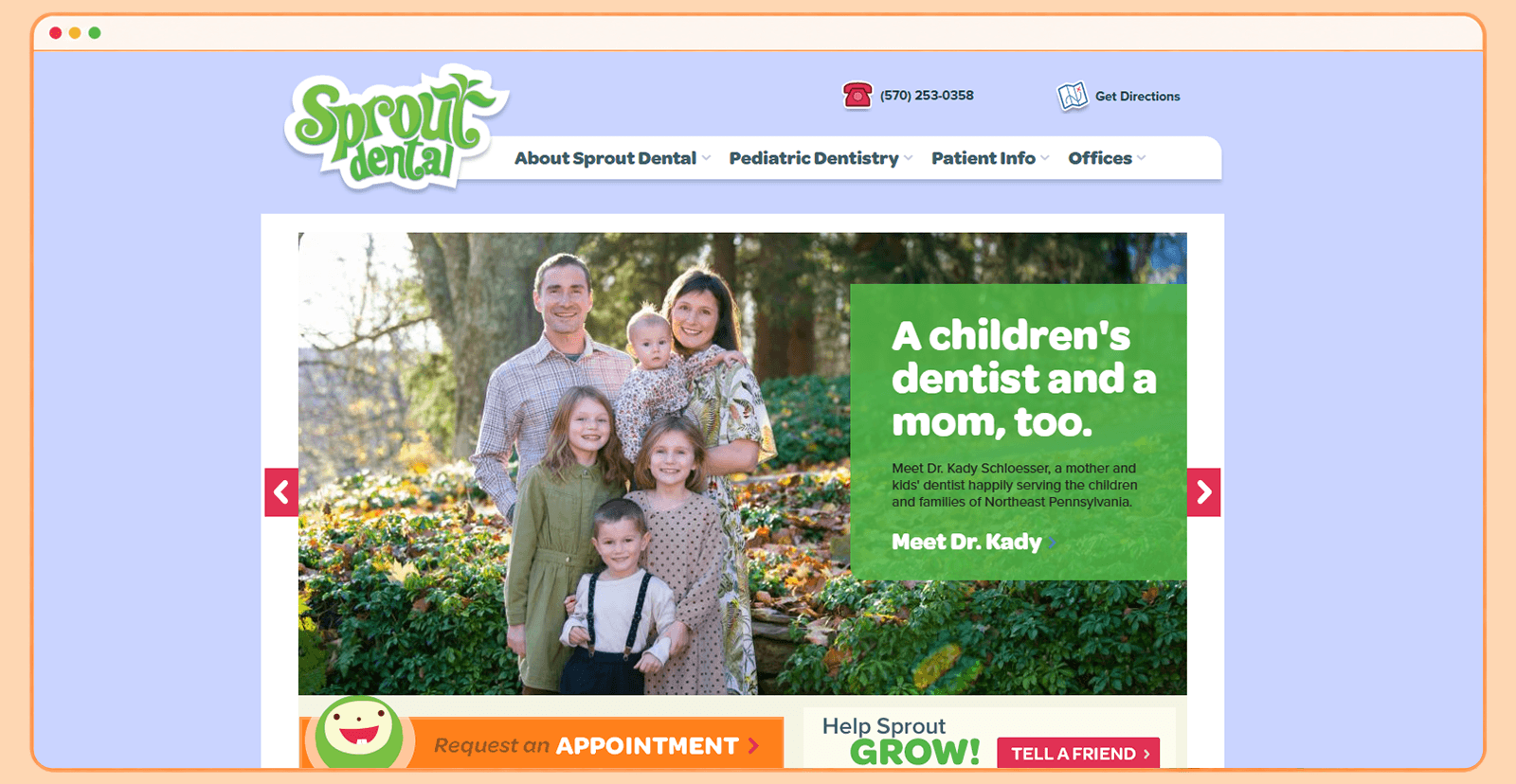
Sprout Dental uses a playful, child-friendly website that combines warm visuals, approachable messaging, and intuitive navigation to make pediatric dentistry feel less intimidating.
What makes Sprout Dental's website stand out?
The website immediately establishes a strong child-focused identity rather than looking like a conventional dental practice website. Its navigation is unusually comprehensive but organized around parents' and children's needs, with dedicated sections for pediatric procedures, treatment options, behavior management, dental tips, first visits, insurance, mobile check-in, and office policies.
Why does this design appeal to patients?
The biggest conversion strength is anxiety reduction. Parents aren't simply told that Sprout provides pediatric dentistry; they're shown how the practice makes dental visits more comfortable for children. This is particularly effective because several homepage testimonials describe children becoming calmer and even looking forward to dental visits.
A closer look at their website:
What the Best Dental Website Designs Teach Us About Patient-Focused Design
Although these 10 websites use very different visual styles, they share several principles that make them effective at converting visitors into patients.
1. Make strong first impressions
A strong hero section should communicate the practice's identity, services, and value within seconds. Strong headlines, relevant imagery, clear positioning, and visible appointment CTAs help people understand the practice without scrolling through the entire website.
2. Make booking options easy to find
A well-designed website won't generate appointments if people can't figure out how to book. The strongest dental websites make appointment CTAs visible throughout the user journey, not only on the contact page.
3. Build trust into every page
Patients want reassurance before choosing a dentist. Reviews, credentials, team profiles, professional photography, and clearly explained treatments all help establish credibility.
4. Break away from clinical design templates
The examples in this guide demonstrate how dramatically dental branding can vary. A practice can use editorial, luxury, playful, minimalist, or technology-driven design while still communicating professionalism and care.
5. Use visuals to reduce patient anxiety
Photography, video, color, typography, and whitespace influence how patients perceive a practice. A calming visual language can make a dental experience feel less intimidating, while approachable imagery can help humanize the team.
6. Answer patient questions before they ask
Patients often arrive with specific concerns: What treatments do you offer? How much does it cost? Do you accept my insurance? Where are you located? Can I book online? A good website anticipates these questions instead of forcing people to call the practice for basic information.
Conclusion
The best dental website designs do more than look polished. They communicate the practice's identity, answer patient questions before they're asked, build trust through transparency, and make the path to booking as short as possible. The 10 examples in this guide prove that dental websites don't have to follow a clinical template. Whether the brand is luxurious, playful, minimalist, or calming, every design decision should reduce the distance between a visitor's first impression and their decision to book.
Need a Dental Website That Converts Visitors Into Patients?
Quixta designs and builds dental practice websites with patient-focused UX, conversion-driven design, SEO, and scalable development for solo practices, group clinics, and multi-location dental organizations. If your practice is planning a new website or a redesign, talk to Quixta about your project.
FAQs
A good dental website combines strong visual design, intuitive UX, and clear conversion paths into a unified patient experience. It should immediately communicate what the practice offers, who it serves, where it is located, and how patients can book. Key elements include service pages, dentist profiles, testimonials, treatment details, insurance information, and prominent appointment options. The website should also work well on mobile devices and meet accessibility standards so that patients with different abilities and devices can use it without difficulty.
Every dental practice website should include information about the practice, its dentists, services, location, contact details, and appointment process. Prominent calls to action should make it easy to book an appointment or reach the office. Patient reviews and testimonials provide social proof. Service pages should answer common questions and explain treatments in patient-friendly language. Additional elements that strengthen a dental website include an FAQ section, insurance information, office policies, team photos, and new-patient resources.
A dental website increases bookings by reducing friction between a visitor's first interaction and the appointment process. This means placing descriptive CTAs like "Book an Appointment" at logical points throughout the website, not just on the contact page. Trust signals such as reviews, dentist credentials, treatment results, and patient-focused content reduce uncertainty. Clear service pages help people understand whether the practice meets their needs. Fast loading speed, accessible interfaces, and mobile-friendly forms also reduce abandonment before someone completes a booking.
Trust comes from a combination of design, content, transparency, and social proof. Professional photography and consistent branding make a practice appear established and credible. Dentist biographies, qualifications, memberships, patient testimonials, reviews, and before-and-after results provide reassurance. Clearly explained treatments, transparent pricing, and an accessible, secure, and easy-to-use website reinforce the impression that the practice takes the patient experience seriously from the first interaction.
Mobile design is critical because many prospective patients discover dental practices while searching on their phones. A mobile-friendly website should adapt its layout, typography, images, navigation, forms, and CTAs to smaller screens. Appointment buttons should be easy to tap, phone numbers should be accessible with one tap, and forms should not require unnecessary typing. Google also uses mobile-first indexing, which means the mobile version of the site affects how the website ranks in search results.
Yes. Online appointment booking makes it significantly easier for patients to take action. Some patients prefer scheduling outside normal office hours or may not want to call. An integrated booking feature reduces the steps between discovering a practice and securing an appointment. The booking CTA should be clearly visible across the website, not buried in the navigation or contact page. Practices that add online booking often see more completed appointments compared to those that rely only on phone calls.
SEO helps dental practices appear in search results when potential patients look for relevant services in their area. A well-optimized website targets searches related to treatments, dental specialties, locations, and common patient questions. Important SEO elements include optimized title tags and meta descriptions, location-specific service pages, schema markup, fast page speed, mobile responsiveness, and quality content. SEO should work alongside UX, not replace it. Attracting traffic matters only if the website can turn it into inquiries and appointments.
A dental practice website typically costs between $2,000 and $25,000+, depending on whether it uses a template or custom design. Based on typical US market pricing in 2026, a template-based dental website can cost $2,000 to $5,000, but these are typically lightly customized templates with limited design flexibility. A professionally designed custom dental website ranges from $8,000 to $25,000+, depending on the number of pages, custom features, integrations, content creation, and ongoing support. Practices should evaluate what the website will deliver in patient acquisition, not just what it costs to build.
There is no fixed redesign schedule, but dental practices should regularly evaluate whether their website still meets current patient and business needs. A redesign may be warranted when the visual identity feels outdated, the mobile experience is poor, the underlying technology becomes difficult to maintain, or appointment conversions decline. The goal is to keep the website accurate, fast, accessible, secure, and aligned with the practice's current goals and services.
A professional web design agency brings together strategy, UX, branding, development, SEO, accessibility, and conversion optimization rather than treating the website as a purely visual project. Dental practices have specific requirements around patient journeys, trust, local search, appointment booking, and healthcare-related information. An experienced team can design the website around those requirements while creating a distinctive brand experience that differentiates the practice from competitors using generic templates.