

A SaaS website wears many hats. It must introduce a product, explain what it does, establish its perceived value, and persuade visitors to take action. That's a lot to ask from a few pages and a well-placed CTA. Webflow gives SaaS companies the design flexibility and CMS tools to build experiences that go beyond generic landing-page templates. Strong examples do more than look polished. They make complicated products easier to understand, create memorable brand experiences, and guide visitors towards the next step.
So, what does exceptional SaaS design look like in practice? These ten Webflow SaaS examples offer plenty of ideas worth borrowing. Each one demonstrates what effective SaaS website design looks like when built on Webflow.
Jasper
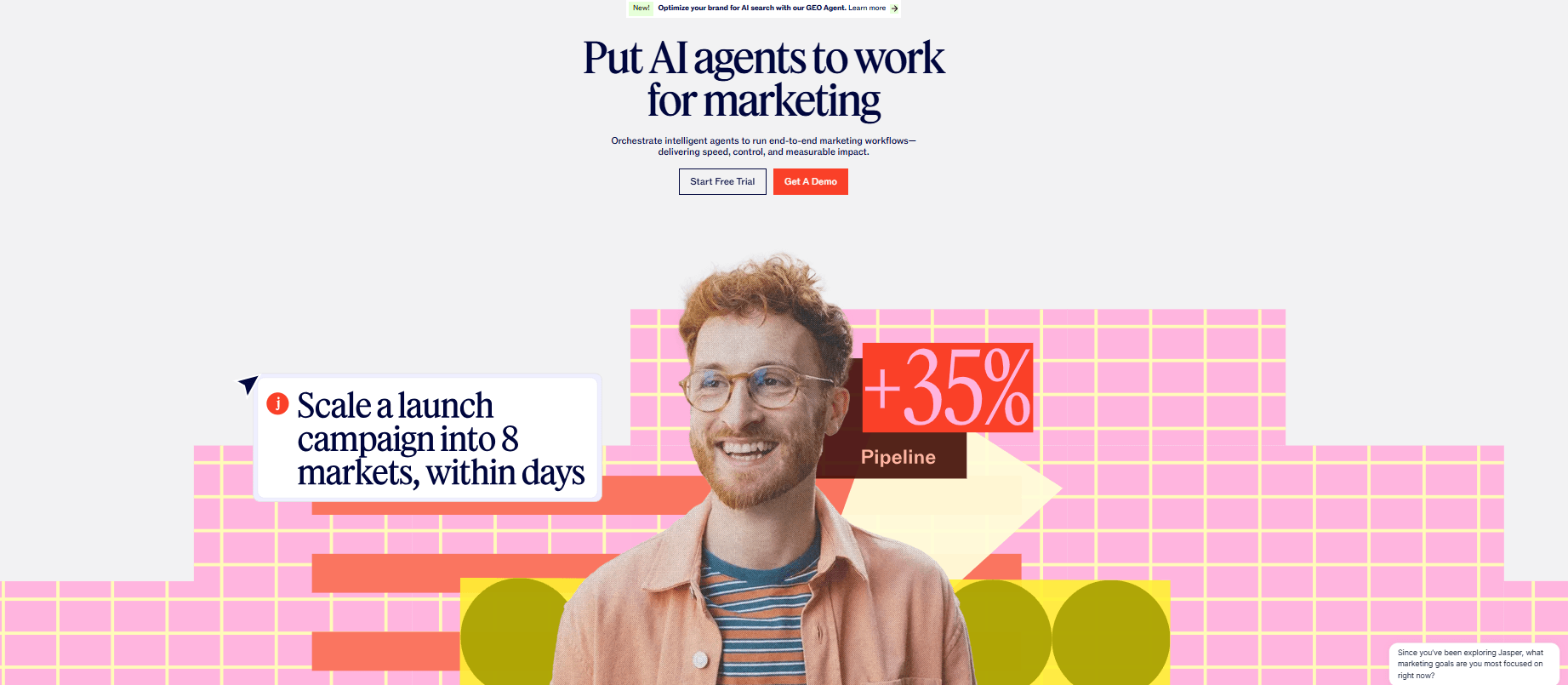
Jasper is an AI marketing platform designed to help create and manage content and campaigns. Its Webflow website was recognized as Brand Transformation of the Year at the 2025 Webflow Awards.
What makes the website stand out?
Instead of presenting AI as an abstract technical concept, Jasper's website uses motion, imagery, and interactive elements to give the product a tangible identity. The animations are particularly effective because they aren't simply decorative. Movement helps guide visitors through the page and adds energy to the brand. The interactive Canvas experience allows visitors to explore Jasper's platform instead of simply reading about its capabilities.
Key Takeaways
Animation is most effective when it serves a clear purpose, such as explaining a feature, demonstrating how a product works, or guiding users through the experience. Use motion strategically to bring your product story to life, not to add visual elements that distract from the message.
A Closer Look at Jasper’s Design:
Superlist
Superlist is a productivity platform built around tasks, lists, projects, and collaborative work. Webflow has featured its website, which was designed by Superlist and developed by 8020.
What makes the website stand out?
Productivity software websites often rely on predictable dashboards, screenshots, and feature grids. Superlist instead builds a visual world around its product. The typography, illustrations, product interfaces, color choices, and movement work together to give the brand a personality. The website feels playful without losing the clarity expected from a productivity platform.
Key Takeaways
A distinctive visual identity can help your product stand out, even in a highly competitive category. Give your SaaS brand a clear personality through unique typography, imagery, color, and design elements that make it instantly recognizable.
A Closer Look at Superlist’s Design:
.png&w=3840&q=100)
.png&w=3840&q=100)
Osmo Supply
Osmo Supply is a platform for creative resources, providing designers and developers with techniques, components, code, and tools. Its Webflow project combines its marketing website and its core product, the Vault, on a single domain.
What makes the website stand out?
Osmo Supply is a great example of how a website can blur the line between marketing and product experiences. The marketing side uses GSAP animations and BarbaJS page transitions to create a smooth, immersive browsing experience. Meanwhile, the Vault behaves much more like an application, with predictive search, video previews, bookmarking, dark and light modes, and protected content.
This approach makes the website feel interactive rather than a static collection of marketing pages.
Key Takeaways
You can go beyond the traditional marketing website. If your product is highly visual or interactive, consider bringing elements of the actual product experience into the website itself.
A Closer Look at their Design:
.png&w=3840&q=100)
.png&w=3840&q=100)
Relume
Relume is a web design platform that helps teams generate sitemaps and wireframes and use a large component library to build websites. It also provides tools for moving designs into Webflow.
What makes the website stand out?
Relume has a potentially difficult communication problem: it offers multiple tools and workflows, but visitors still need to quickly understand what the platform does. The website addresses this through strong product visualization. Instead of relying on paragraphs of explanation, it uses interface examples and visual demonstrations to show how the workflow progresses from planning to design and development.
Key Takeaways
Visitors can understand a complex SaaS product more easily when they can see how its features work together to solve a specific problem. Instead of simply listing features, demonstrate the workflow and show how the product fits into the user’s experience.
A Closer Look at their Design:
.png&w=3840&q=100)
.png&w=3840&q=100)
Wized
Wized is a low-code JavaScript framework that works with Webflow to turn static websites into reactive web applications. It connects Webflow interfaces with APIs, authentication, databases, and other application functionality.
What makes the website stand out?
Wized has a technically complex product to explain, but its visual approach makes the concept more approachable. Rather than expecting visitors to understand the technical architecture immediately, the brand focuses on what users can build with the technology. This makes the product feel less like a collection of technical features and more like an opportunity to create sophisticated web applications.
Key Takeaways
Rather than asking visitors to understand the technology first, show them what they can achieve with it. This helps translate technical functionality into clear, tangible outcomes.
A Closer Look at Their Design:
.png&w=3840&q=100)
.png&w=3840&q=100)
Chili Piper
Chili Piper is a demand-conversion platform that helps businesses manage processes around inbound leads and sales conversations. Its website transformation was recognized as Brand Transformation of the Year at the 2024 Webflow Awards. The project was developed by Webflow Partner Veza Digital.
What makes the website stand out?
Chili Piper's redesign focused on more than creating a visually attractive homepage. The company wanted to reposition itself as a broader platform and establish a cohesive visual identity. The Webflow build incorporated the content into a CMS and added Algolia search functionality to make the large content library easier to navigate. Together, these elements create an experience that is visually cohesive, easy to navigate, and built to convert.
Key Takeaways
A visually appealing homepage is only effective if visitors can easily find the information they need. Align your visual design with your content strategy to create a more cohesive and useful user experience.
A Closer Look at their Website:
.png&w=3840&q=100)
.png&w=3840&q=100)
Typeform
Typeform is a platform for creating interactive forms, surveys, and other data-collection experiences. The company migrated its main website to Webflow with Webflow Partner MakeBuild and was recognized in the 2025 Webflow Awards.
What makes the website stand out?
Typeform's own product is known for making forms feel more engaging, and its website carries that philosophy into the broader brand experience. The design uses subtle interactions and a component-led system to maintain consistency across the site.
The migration to Webflow also demonstrates how a large, established SaaS brand can move from a custom-built marketing site to Webflow without losing its visual identity. The component system carries the existing brand language into a more manageable CMS structure, which is a practical reference for any SaaS team considering the same migration.
Key Takeaways
You can build a design system that improves efficiency without sacrificing consistency. A well-structured system makes it easier for marketing teams to create new pages and campaigns while maintaining a cohesive brand experience.
A Closer Look at Their Design:
.png&w=3840&q=100)
.png&w=3840&q=100)
Greenhouse
Greenhouse is a hiring and talent-management platform that helps organizations manage recruitment and related processes. Its Webflow website was a finalist for Technical Achievement of the Year in the 2025 Webflow Awards.
What makes the website stand out?
Enterprise SaaS websites often have to communicate a huge amount of information, from product capabilities and integrations to resources, customer stories, and industry-specific solutions. Greenhouse shows how to organize that complexity without making the experience feel like a database of corporate information. The design also demonstrates that enterprise software doesn't need to rely on an overly conservative visual language.
Key Takeaways
A professional SaaS website doesn't have to rely on a conservative visual style. A B2B SaaS website can maintain a credible, polished appearance while using distinctive typography, bold layouts, engaging imagery, and thoughtful interactions.
A Closer Look at their Website:
.png&w=3840&q=100)
.png&w=3840&q=100)
Domo
Domo is a business intelligence and data platform that helps organizations bring together data, analytics, and business insights. Its Webflow project was a finalist for Technical Achievement of the Year in the 2025 Webflow Awards.
What makes the website stand out?
Data and analytics products can be challenging to market visually. Domo's approach shows how product visualization can become part of the brand experience. Data-oriented visuals help communicate the nature of the platform while giving visitors something concrete to associate with the product.
The website also handles the challenge of communicating to multiple audiences: technical users who want to see data capabilities, and business leaders who want to understand outcomes. The visual approach serves both by making the platform's capabilities concrete without requiring deep technical knowledge to appreciate them.
Key Takeaways
You can turn your product interface into a powerful visual asset. Dashboards, charts, workflows, and other product elements can showcase your product’s value while making the website more engaging and informative.
A Closer Look at Their Website:
.png&w=3840&q=100)
.png&w=3840&q=100)
ChainGPT
ChainGPT is a Web3 platform offering AI-powered tools and services built around blockchain technology. Its Webflow website was recognized in the 2025 Webflow Awards for its combination of branding, 3D animation, and interactive experiences.
What makes the website stand out?
ChainGPT takes a highly immersive approach to a technology category that can otherwise be difficult to communicate visually. The website incorporates 3D visuals, on-scroll Lottie animations, Rive interactions, and GSAP-powered text effects. These elements create a futuristic visual language that aligns closely with the company's AI and Web3 positioning.
Key Takeaways
Let your visual language reflect your industry and brand positioning. For products in innovative or highly visual categories, motion, 3D elements, and interactive experiences can communicate that positioning and create a strong first impression before visitors even read the copy.
A Closer Look at Their Design:
.png&w=3840&q=100)
.png&w=3840&q=100)
What the Best SaaS Webflow Websites Have in Common
Despite different visual styles, the strongest examples share several principles.
- They make the product visible: Jasper, Relume, and Domo all bring product interfaces into the marketing experience rather than hiding them behind a demo request form.
- They have distinctive identities: Superlist and ChainGPT prove that SaaS websites don't need to follow the same visual playbook. A clear visual personality makes the brand memorable before the visitor reads a word.
- They use interaction with purpose: Osmo Supply’s GSAP animations and Jasper's interactive Canvas aren't decorative. They serve the story by revealing information progressively or letting visitors explore the product.
- They simplify complexity: Wized and Relume both face the challenge of explaining technical products. Both solve it by showing what users can build rather than explaining how the technology works.
- They think beyond the homepage: Chili Piper and Greenhouse demonstrate that the homepage is just the entry point. Resource libraries, customer stories, and solution pages need the same design attention.
- They connect design to business goals: Typeform's component-led system isn't just aesthetically consistent. It lets the marketing team ship new pages without developer involvement, which directly supports growth velocity.
How Quixta Builds High-Impact Webflow Websites
The websites above demonstrate that there is no single formula for creating an effective SaaS website. Some rely on immersive animation, some make the product itself the centerpiece, while others focus on branding, content architecture, or highly structured user journeys.
Quixta approaches Webflow website design with a focus on:
- Custom Webflow Experiences: Quixta creates custom Webflow websites rather than relying on generic templates, aligning the design with the brand, product, audience, and business goals.
- Interactive Product Experiences: For SaaS companies, Quixta can create interactive pages and custom animations that make complex products easier to understand and reinforce the brand's visual identity.
- Scalable CMS Architecture: CMS-driven resources, case studies, blogs, and landing pages let marketing teams manage and expand their websites without relying on developers for every update.
- Reusable, Flexible Components: A modular approach makes it easier to create new pages and campaigns while maintaining a consistent visual identity as the business grows.
- Design That Goes Beyond Aesthetics: Quixta combines visual appeal with clear messaging, intuitive navigation, responsive design, and conversion-focused UX to build Webflow websites for both users and long-term business growth.
Conclusion
Great SaaS Webflow websites do more than look impressive. Every visual, interaction, and content decision helps visitors understand the product and see its value. Jasper uses motion to make AI feel tangible. Superlist builds a memorable personality around productivity, while Relume turns a complicated workflow into an easy-to-follow visual experience. Typeform shows how a scalable design system can support consistency without sacrificing creativity.
The lesson is not to copy another company's colors, layouts, or animations. Borrow the thinking behind them. If your product is hard to explain, show it working instead of describing it (Relume, Wized). If your category is crowded, invest in a visual identity that's unmistakable (Superlist, ChainGPT). If your marketing team ships pages weekly, build a component system that maintains consistency without slowing them down (Typeform, Greenhouse). And if your product is visual, bring it into the marketing experience rather than gatekeeping it behind a demo form (Jasper, Domo). Make the product visible, simplify the message, and ensure every design choice serves both the audience and the business.
Frequently Asked Questions
Webflow is a strong choice for SaaS companies because it combines visual design flexibility with powerful content management capabilities. It lets designers and developers create custom layouts, interactions, animations, and responsive experiences without being limited by rigid templates. This flexibility is particularly useful for SaaS companies that need to explain complex products in engaging ways.
An effective SaaS website should make the product easy to understand while showing why it matters to the target audience. A strong visual hierarchy helps visitors quickly identify key information and understand where to go next. A distinctive visual identity can also help a SaaS brand stand apart from competitors. At the same time, the website needs intuitive navigation and clear calls to action to support conversions.
Animation can help SaaS companies explain products, guide attention, and create a more engaging browsing experience. However, animation should have a clear purpose rather than being added simply because it looks impressive. Scroll-based effects can reveal information progressively, while micro-interactions can provide feedback when users interact with different elements. Companies should also ensure that animations don't slow down the website or interfere with accessibility.
Jasper and Superlist demonstrate the importance of developing a distinctive visual identity for a SaaS brand. Jasper uses motion, interactive elements, and visual storytelling to make its AI product feel more tangible and engaging. Superlist takes a more playful approach, using typography, illustrations, product visuals, and movement to give its productivity platform a recognizable personality. Both examples show that SaaS websites don't have to follow the same predictable structure of a hero section, feature grid, and testimonial carousel.
The best approach is to show visitors how the product works instead of relying entirely on written explanations. Organizing features around specific user problems can make the information more relevant and easier to understand. Relume and Wized, for example, show how product-focused visual experiences can communicate complex workflows and technical capabilities. Clear headings and concise copy should support these visuals, not compete with them.
SaaS websites shouldn't treat design and conversion as competing priorities because good design can directly support conversion. A visually impressive website may attract attention, but it still needs clear messaging, intuitive navigation, and compelling calls to action to turn visitors into leads or customers. Good UX can reduce friction by helping visitors find relevant information quickly. The strongest SaaS websites combine visual identity with clear conversion paths.
Product visualization is extremely important because SaaS products are intangible and can sometimes be difficult to understand from text alone. Screenshots, dashboards, animations, and interactive product demonstrations give visitors a concrete idea of what they are getting. They can also help potential customers visualize how the software fits into their workflows. The goal is to demonstrate value, not simply display as many product screens as possible.
Webflow can support website growth through its CMS, reusable components, structured content, and visual development environment. A well-planned component system allows teams to create new pages while maintaining consistent layouts and branding. A scalable Webflow architecture can therefore give marketing teams greater independence as the company expands.
A SaaS website should typically include a clear value proposition, product visuals, concise explanations of key features, strong calls to action, and trust-building content. Depending on the product, interactive demonstrations or animations can make the offering easier to understand. Customer stories, testimonials, integrations, case studies, and other proof points can also help establish credibility. A well-structured navigation system is essential when the company offers multiple products, solutions, or resources.
A specialized agency can handle UX design, custom Webflow development, responsive layouts, animations, CMS architecture, and reusable components. Quixta focuses on creating custom Webflow experiences that align the website with the company's brand, audience, product, and business objectives. Its approach can also support scalable CMS structures and reusable components that make future website updates easier. The result is a Webflow website designed not only to look impressive at launch but also to remain useful and adaptable as the SaaS business grows.
